Each control has a default template. This gives the control a basic appearance. The default template is typically shipped together with the control and available for all common windows themes. It is by convention wrapped into a style, that is identified by value of the DefaultStyleKey property that every control has.
The control template is often included in a style that contains other property settings. The following code sample shows a simple control template for a button with an ellipse shape.
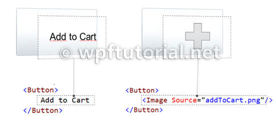
When you create a custom control template and you want to define a placeholder that renders the content, you can use the ContentPresenter. By default it adds the content of the Content property to the visual tree of the template. To display the content of another property you can set the ContentSource to the name of the property you like.
There is something you need to know when setting a value of an element within a control template: The value does have a lower precendence as the local value! So if you are setting the local value in the constructor of the contained element, you cannot override it within the controltemplate. But if you use the element directly in your view, it will work. So be aware of this behavior!.
Here you can find more information about DependencyProperty value precendence: Dependency Property Value Precedence
 |
| BALAJI | |
|
| Commented on 10.March 2009 |
| nice
|
|
|
|
| ike nich | |
|
| Commented on 8.April 2009 |
| ...
|
|
|
|
| Andrei Drynov | |
|
| Commented on 20.April 2009 |
I especially liked "Focussed" and "Thikness"
Nice article, Chris!
|
|
|
|
| Christian Moser | |
|
| Commented on 20.April 2009 |
Hi Andrei,
I corrected the typos in the graphics ;-)
Thanks for the feedback!
|
|
|
|
| alexlll80 | |
|
| Commented on 7.May 2009 |
| very nice.
|
|
|
|
| Rasbeer | |
|
| Commented on 13.May 2009 |
| Good one!
|
|
|
|
| khaled | |
|
| Commented on 17.May 2009 |
| i really like it thankyou
|
|
|
|
| Swathi | |
|
| Commented on 3.June 2009 |
| Can you give an example for Data Template also?
|
|
|
|
| DaniBoi | |
|
| Commented on 29.September 2009 |
| How to make something like a ASP .Net Master Page in WPF
|
|
|
|
| Diana | |
|
| Commented on 23.October 2009 |
| Thanks, your posts are very very useful!
|
|
|
|
| om | |
|
| Commented on 6.November 2009 |
Can we partially override the Control Style?
Like in comboBox i dont want ToggleButton but other combobox should be as it is?
|
|
|
|
| jojo | |
|
| Commented on 7.January 2010 |
| good one!!!
|
|
|
|
| Witschi | |
|
| Commented on 14.January 2010 |
Hello your doing a nice job!
I'm beginner and don't understand the trigger part could you add an example please?
|
|
|
|
| Wendell | |
|
| Commented on 26.January 2010 |
| With what program or software dis you make the graphics? They are aawessooomeee and I'm really jealous ... Oh nice explanation tho thankx man!
|
|
|
|
| estie | |
|
| Commented on 10.February 2010 |
So clear,
thankx.
|
|
|
|
| Abirami | |
|
| Commented on 10.March 2010 |
Hi Chris,
This is really very useful for me, as I am a beginner..
Thanks for this wonderful site :)
|
|
|
|
| priya | |
|
| Commented on 23.April 2010 |
Hi Mosers
u r explaining in a simple and superb way
|
|
|
|
| Swapnil Sawant | |
|
| Commented on 6.May 2010 |
| a very good site. Thank you
|
|
|
|
| ebrahimi | |
|
| Commented on 9.May 2010 |
| very good
|
|
|
|
| narayana | |
|
| Commented on 20.May 2010 |
| superb article keep posting
|
|
|
|
| kln | |
|
| Commented on 1.July 2010 |
| Nice One!!Good Presentation
|
|
|
|
| chintan darji | |
|
| Commented on 14.July 2010 |
| Superb article.
|
|
|
|
| Paresh | |
|
| Commented on 23.July 2010 |
| Simply Superb Article for Beginner :) need more article on WPF,
|
|
|
|
| Paresh | |
|
| Commented on 23.July 2010 |
| Simply Superb Article for Beginner :) need more article on WPF,
|
|
|
|
| Paresh | |
|
| Commented on 23.July 2010 |
| Simply Superb Article for Beginner :) need more article on WPF,
|
|
|
|
| ouais | |
|
| Commented on 29.July 2010 |
| you people I really not getting why you are congrat this guy ! This site is uglying explaning WPF ! just good to run away and find real explanation from programmer !
|
|
|
|
| i | |
|
| Commented on 3.September 2010 |
| seems really interesting thanks for your efforts to make this material available for us
|
|
|
|
| Arjun | |
|
| Commented on 3.September 2010 |
| Nice one
|
|
|
|
| Asha.MP | |
|
| Commented on 12.October 2010 |
Fill="{TemplateBinding Background}" Stroke="{TemplateBinding BorderBrush}"
in the above properties we can specify the colors also, what is the meaning of TemplateBinding in the above property??
|
|
|
|
| siva | |
|
| Commented on 19.October 2010 |
nice...
|
|
|
|
| Praveen | |
|
| Commented on 22.November 2010 |
| Great Article , thanks for your efforts :)
|
|
|
|
| bala | |
|
| Commented on 24.January 2011 |
| very nice.
|
|
|
|
| sri | |
|
| Commented on 21.February 2011 |
| good one
|
|
|
|
| prassanth | |
|
| Commented on 24.March 2011 |
| if u dont mind , can u thrown some light on visualstatemanager as well.. ?
|
|
|
|
| Ankit | |
|
| Commented on 17.April 2011 |
| Many many thanks for this article...
|
|
|
|
| Gurpreet Singh | |
|
| Commented on 21.April 2011 |
| Great explaination ! thanks
|
|
|
|
| Tejas | |
|
| Commented on 23.April 2011 |
Thanks buddy good articles
|
|
|
|
| Janynne Gomes | |
|
| Commented on 26.April 2011 |
| Great explanation and i liked the figure, so clear!
|
|
|
|
| anon | |
|
| Commented on 4.May 2011 |
| These comments are laughably fake.
|
|
|
|
| Paras | |
|
| Commented on 18.May 2011 |
| Thanks, Nice explanation
|
|
|
|
| Anon | |
|
| Commented on 24.May 2011 |
| Great. And where do i have to write the style-tag down, now?
|
|
|
|
| Mayank | |
|
| Commented on 1.June 2011 |
| So Clear very nicely explained
|
|
|
|
| jones | |
|
| Commented on 14.June 2011 |
| please show, how to focus and enable the elliptic button
|
|
|
|
| bm | |
|
| Commented on 9.July 2011 |
| So Clear nice
|
|
|
|
| Dmitry | |
|
| Commented on 12.July 2011 |
| Thank you! This tutorial is awesome!
|
|
|
|
| Alibaba | |
|
| Commented on 13.July 2011 |
| I want to create Template for TextBox. How can I aceess RelativeSource TEXT property.
|
|
|
|
| stigma | |
|
| Commented on 18.July 2011 |
@Alibaba: If I am understanding you correctly, you would not use RelativeSource to bind to the text property. You would use "{TemplateBinding Text}". For example:
<TextBlock Text="{TemplateBinding Text}"/>
Using a TextBox inside a TextBox ControlTemplate, however, I have found to be very unhelpful. Try using: <ScrollViewer x:Name="PART_ContentHost"/> If you name the ScrollViewer exactly as I have here, the text will be bound to it. No other work required.
|
|
|
|
| Ziad | |
|
| Commented on 22.August 2011 |
| Life Saver :)
|
|
|
|
| johnson | |
|
| Commented on 5.September 2011 |
| Machi awesome article...Thanks !!!
|
|
|
|
| Gonzalo | |
|
| Commented on 20.September 2011 |
| Viva linux!!
|
|
|
 Share...
 Feed
About Christian Moser
Feed
About Christian Moser


 Comments on this article